Create a reusable custom Button in React Native with Native Base and Prop Types.


React Native is a popular framework for building native mobile applications using JavaScript. One common feature in mobile apps is the ability to display buttons for the user to interact with. In this blog post, we will learn how to create custom buttons in React Native.
First, let's create a basic button using the Button component provided by React Native. We can do this by importing the Button component from the react-native library and then using it in our JSX code like so:
import { Button } from 'react-native';

const MyButton = () => {
  return (
    <Button
      title="Press me"
      onPress={() => alert('Button pressed!')}
    />
  );
};
This will create a basic button with the text "Press me" that displays an alert when clicked.
Although this Button Isn’t very Customisable and doesn’t look great. there is the option of creating your own custom button using TouchableOpacity and then adding your custom styles.
import {Text, TouchableOpacity StyleSheet} from 'react-native';

    <TouchableOpacity style={styles.container}>
      <Text> hello button </Text>
    </TouchableOpacity>
Using Native Base Component to
import { Button } from "native-base";
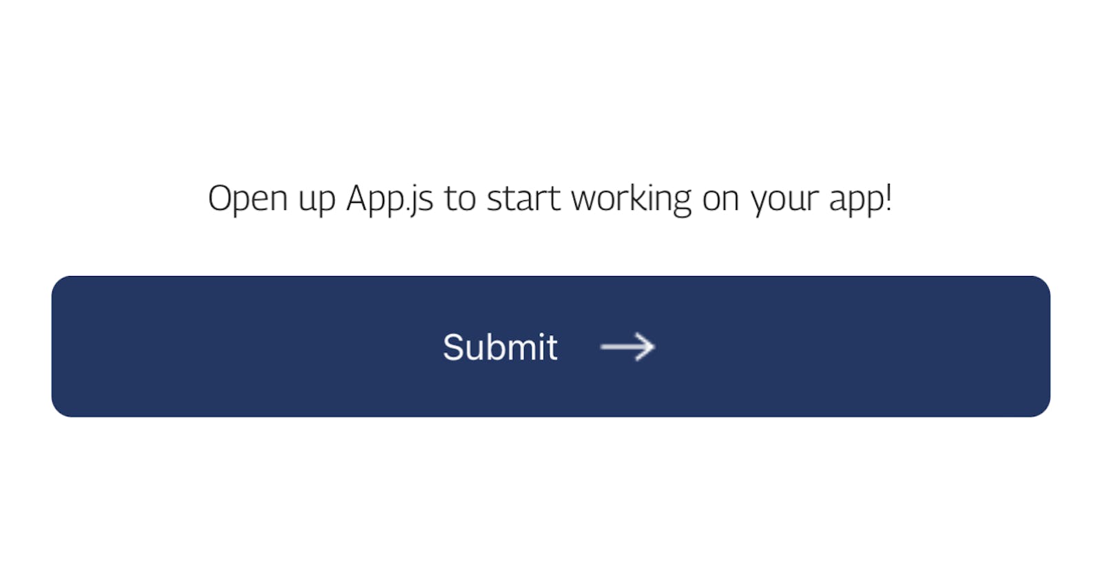
Using Native base to achieve Button with Various states and Icon.

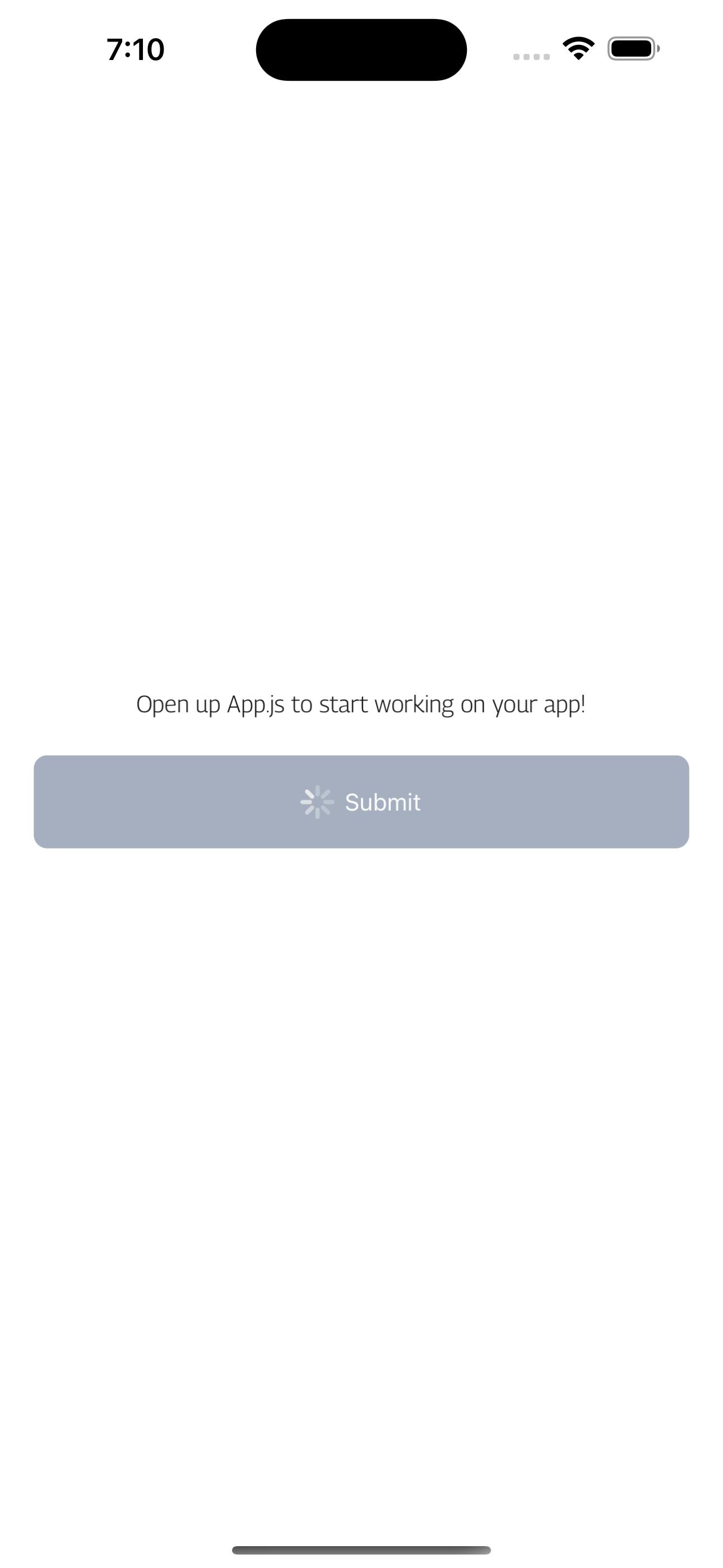
const CustomButton = ({
    title,
    onPress = () => {},
    isLoading,
    isIcon,
    ...props
}) => {
    return (
        <Button
            isLoading={isLoading}
            isLoadingText={title}
            onPress={onPress}
            activeOpacity={0.7}
            borderRadius="8"
            bg="primary.main"
            style={{
                height: 55,
                width: "100%",
                marginVertical: 20,
                justifyContent: "center",
                alignItems: "center",
            }}
            endIcon={
                isIcon ? (
                    <Image
                        source={arrow}
                        ml="2"
                        alt="arrow"
                        style={{
                            height: 20,
                            width: 25,
                            resizeMode: "contain",
                        }}
                    />
                ) : null
            }
            {...props}
        >
            {title}
        </Button>
    );
};
Adding Prop Types to your component.
import PropTypes from "prop-types";

CustomButton.propTypes = {
    title: PropTypes.string.isRequired,
    onPress: PropTypes.func.isRequired,
    isLoading: PropTypes.bool,
    isIcon: PropTypes.bool,
};
Your Button component should end up looking like this.
import { Button, Image } from "native-base";
import PropTypes from "prop-types";
const arrow = require("../assets/arrow.png");

//
const CustomButton = ({
    title,
    onPress = () => {},
    isLoading,
    isIcon,
    ...props
}) => {
    return (
        <Button
            isLoading={isLoading}
            isLoadingText={title}
            onPress={onPress}
            activeOpacity={0.7}
            borderRadius="8"
            bg="primary.main"
            style={{
                height: 55,
                width: "100%",
                marginVertical: 20,
                justifyContent: "center",
                alignItems: "center",
            }}
            endIcon={
                isIcon ? (
                    <Image
                        source={arrow}
                        ml="2"
                        alt="arrow"
                        style={{
                            height: 20,
                            width: 25,
                            resizeMode: "contain",
                        }}
                    />
                ) : null
            }
            {...props}
        >
            {title}
        </Button>
    );
};

CustomButton.propTypes = {
    title: PropTypes.string.isRequired,
    onPress: PropTypes.func.isRequired,
    isLoading: PropTypes.bool,
    isIcon: PropTypes.bool,
};
//
export default CustomButton;
Import your component and you are good to go
<CustomButton onPress={() => console.log("clicked!!!")} isLoading={true} isIcon={true} title={"Submit"} />